Welcome to our MTG artists interview series (#19), 'There's No Magic Without Art'
We had the chance to catch up with Yeong-Hao Han and talk about his work on Magic: The Gathering. Enjoy!
Hi Yeong-Hao Han. We saw your first Magic card six years ago. How did you got started?
I submitted some work to Jeremy Jarvis. The work had a lot of photo textures in it, which I knew wasn't really Wizards style, so I didn't really think anything would come of it. Jeremy got back to me saying the work was perfect for the upcoming set. That set turned out to be Return to Ravnica.
Were you familiar with the game at the time?
I used to play 4th Edition back in the day. To be honest, my play group was so rudimentary compared what I see people doing now. I'm not sure if it's the internet that has people sharing information or if the game simply evolved over time, but my gameplay was childish in comparison.
Can you give us a brief description of your painting process?
I always start out with thumbnail sketches in a sketchbook. Then I blow them up and do a rough, black and white painting on the computer and submit that to Wizards. Once that sketch is approved, the process deviates from painting to painting.
It really depends on the subject matter and how I want the final painting to look. Sometimes I start with a traditional painting, or I might build a 3D model, other times I'll do a really detailed line drawing, and most often I'll jump in digitally. Whatever the process, I always bring the illustration back to Photoshop to finish the painting.
You painted the five weapons of the powerful Gods from the Theros block, how did these cards came to be?
I was given an art description that said the weapon is floating in the sky and with the Starry Nyx Mechanic glowing in the shadows. The weapons had already been designed, along with their prospective gods. My first pass on the cards, I did dramatic up shots at the sky with the weapons dropping down about to wreak havoc on the people below. Jeremy Jarvis, the art director, came back and told me to tone it down. Wizards was actually just looking for a plain side view of the weapon in the sky.
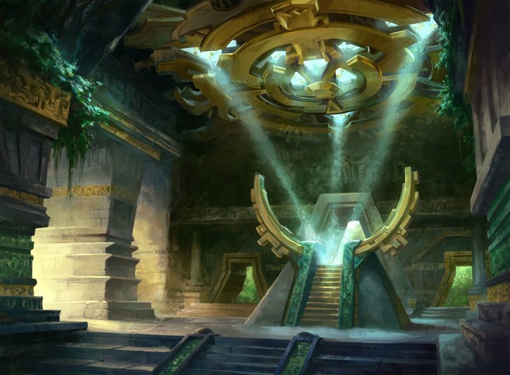
I was a little bummed out because it's hard to make a really dynamic looking image with these requirements. The weapons themselves are very simple in design, so it's not like I could go crazy with some ornamentation. Because of all of this, I put most of the emphasis on the clouds, to spice up the image.
In terms of getting a set of cards to work on, getting 5 paintings is definitely better than 1! One of my favorite parts of working on Magic is seeing my cards get play, but generally, I don't know if the card is going to be any good. In this case, I figured one of these weapons will be decent enough to see some play time.
What cards were the most challenging to paint, and why?
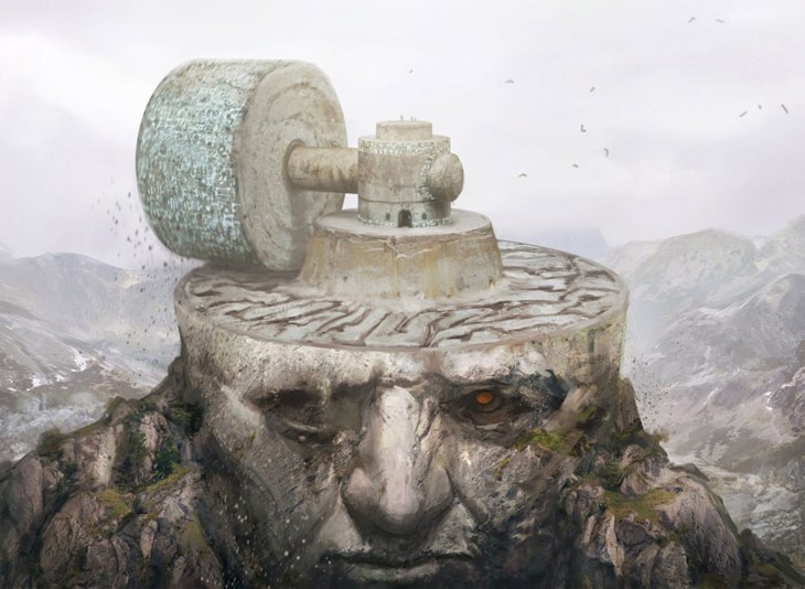
The hardest cards for me are when there are a ton of descriptors in the description. Wandering Tombshell is an example of this. The art description was something like: A gigantic, rotting, zombie tortoise, with ruins on it's back, walking through a swamp. It's hard enough to paint a giant tortoise, but it has to be a zombie as well! The buildings are ruins means I'm really limited in camera angles because they need to read as well on a small card.
When doing new art for an existing card, do you take into consideration the old art, or does it depend on the art description?
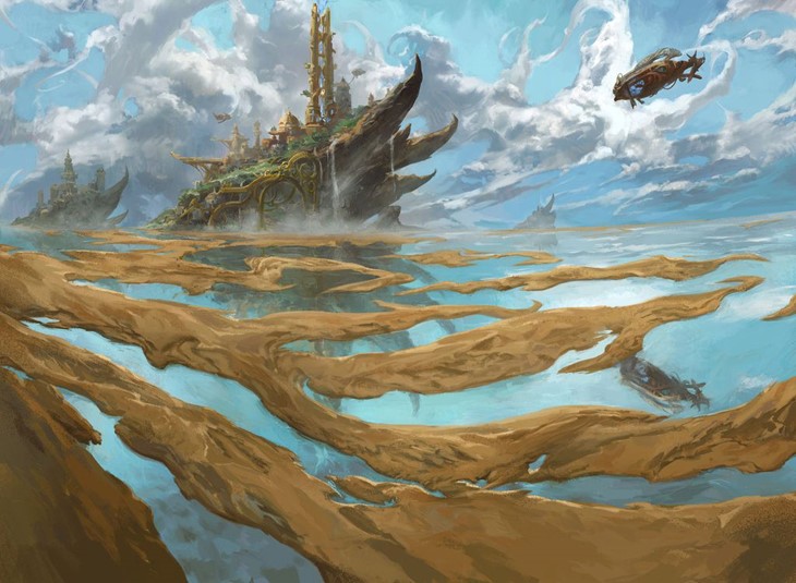
I do look at old art. For reprints, I think it's really important to take the history of Magic into account, especially since a lot of reprints are popular cards. I try my best to do something different from the previous card art. For example, Maze of Ith already had 2 versions: An organic labyrinth, and a man-made prison version. I tried to do a combination of the two, which is still man-made but forming an undulating organic landscape.
Do you ever put some easter eggs/hidden elements on your paintings?
Not so much, but it is an interesting idea. Maybe that's something I'll try incorporating in future paintings.
Can you name some favorites among the art you made for Magic?
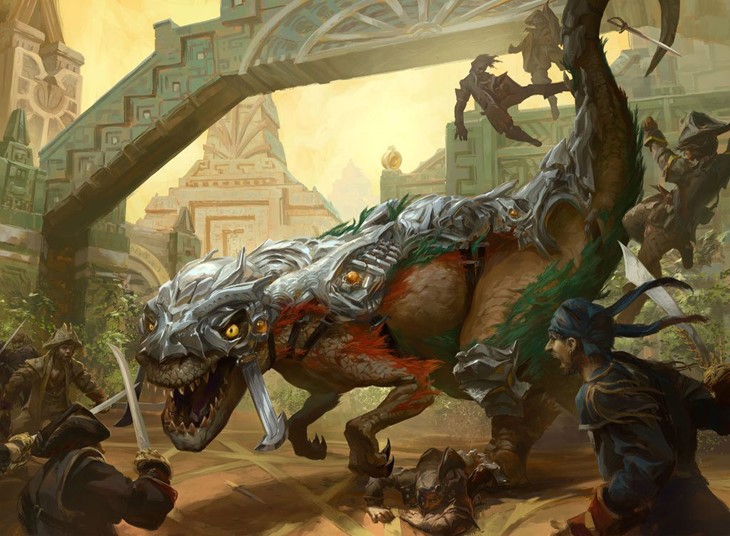
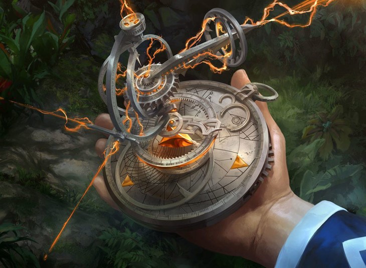
My answer is always the same. I really loved painting Wall of Limbs and was totally bummed out when I found out the card sucked. Carnage Tyrant and Thaumatic Compass are also cards where I like how the art turned out..
Where can our readers find you and learn more about your work?
You can view my work at artstation.com/fooyee or deviantart.com/fooyee/gallery, I'm really bad with updating my work, so I tend to be a set or two behind.

