Welcome to our MTG artists interview series (#26)!
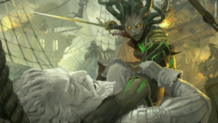
For this week's interview we talked with Clint Cearley, the artist behind very popular cards like - Breya and - Vraska's Contempt.
Tell us a little about how you got started working on Magic.
After years working as a graphic designer I decided to move into illustration so over the course of 2-3 years I put together a portfolio. I did get some "starter" commissions for small indie projects while building the portfolio but it wasn't much. Once I felt my work was equivalent to the work Magic was producing I tracked down the art submission email and sent in my portfolio.
It was a single JPG image with a collage of different images I had done and showed a variety of subjects, color schemes and lighting. About two weeks later I received an acceptance email and filled out the paperwork to begin. It was straightforward in my case and I've been doing work with Magic consistently since then.

Can you give us a brief description of your painting process for Magic cards?
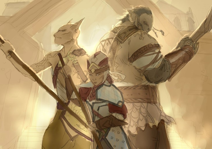
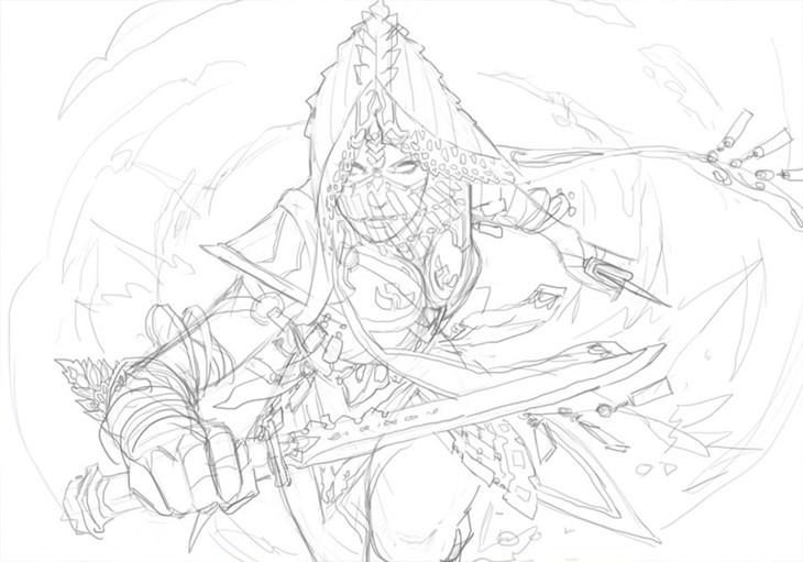
The usually start with thumbnail compositions on paper after reading the card brief. In the sketches I determine the layout, basic poses and composition. From there I'll either scan the sketch or just redraw it in Photoshop with a stylus pad then go collect or create any needed reference images.
Sometimes I'll block it in with just values and add color later while other times I'll go right in with colors. After all the elements are established I send the art director the concept for approval. Taking their feedback I'll continue to develop the scene and details and submit the final. Sometimes last adjustments are requested but usually not.
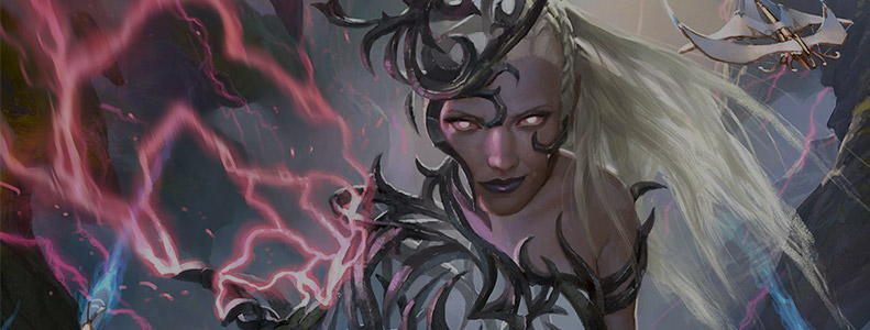
Breya, Etherium Shaper is a very popular card amongst the players. Do you recall the art description, and how this card came to be?
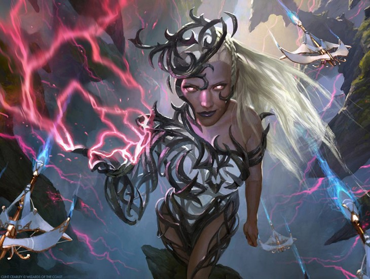
The (abbreviated) direction I received said, "A female human wizard native to Esper. Sections of her body have been replaced with etherium filigree. Breya is standing outside, perhaps high above the ground, blonde hair whipping in the wind. She holds out one filigree hand that is arcing with purple-red lightning. In the distance behind her, perhaps we see thopters flying through the air."
With the complexity of her etherium body parts I wanted a simple pose so things would remain understandable. The trick in her design was finding ways to convey the volume of her body and retain her feminine form with the etherium. The final is very close to the submitted sketch with the exception of the thopters (which apparently weren't optional) and adding a thicker weave of etherium throughout the body (it was more airy to begin with).
How did it feel to paint the box art for the Aether Revolt set?
It was a big honor to be given the opportunity! I remember admiring MTG cards and store displays as a boy and now I was getting to create the "face" of Magic. A little surreal. It's probably good I didn't get the commission early in my career, I may not have had the maturity to deal with the responsibility and time commitment (it spanned 4 months).
That seems quite a long time comparing to regular card commissions. Can you shed some light on why it took longer?
For normal card commissions you work with one art director who has the say so on the project but box art commissions are different. There is your normal AD but also the marketing team, brand team and others who all have a say so and need to give approval on the piece. This can result in many more concepts and alterations needing to be produced and it spanned the Christmas holiday if I remember right (which always slows things down).
What were some of the most challenging cards you painted?
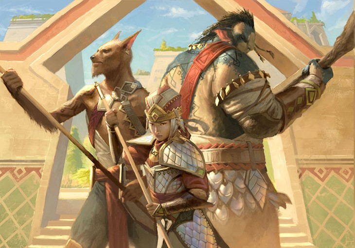
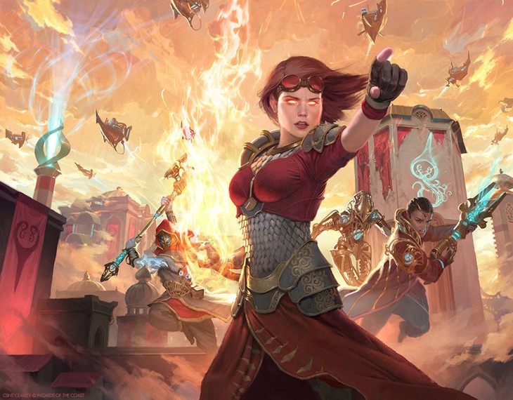
Rite of Ruin comes to mind. The difficulty came from what the direction was asking for: a recognizable view of the (massive) city wall, a large explosion destroying part of the wall (to be the focal point), a mage casting the explosion and an army trying to stop him.
I have 2 inches in which to depict it and it can't look cluttered. I went through a lot of sketches and several color concepts before going with the final. It's a mediocre image in the end but you do your best within the parameters given and move on to the next piece.
On the other hand, were there some of the art descriptions that "immediately clicked"?
Ruthless Ripper for Ugin's Fate. I did Ruthless Ripper for Khans of Tarkir then Ugin rewrites the future in Ugin's Fate which gives us an alternate version of the original Ripper. It was like a "take 2" which you don't get in this job much. I immediately knew what I wanted to change and improve on and still feel that it is one of my stronger MTG images.
Chandra's Revolution and Pia's Revolution are part of the same image. Do you recall other cards you did that had similar connections/Easter Eggs?
The split image was actually requested by the art director and is a element many players may have missed. In Epiphany Storm, part of the vision she sees is the Merfolk from Triton Fortune Hunter. Christopher Rush, who was the artist of the original Black Lotus, passed away while I was painting Time Spiral for MTG online so I added black lotuses in the corners with their petal floating off. I am the model for several of my images: Righteous Blow, Annihilating Fire, Notion Thief, Grapeshot and Messenger's Speed.
Of the art you made for Magic, can you name some favorites?
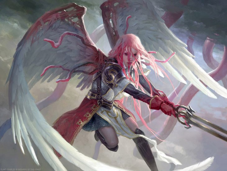
Nissa Vital Force, Jace Ingenious Mind-Mage, Liliana Death Wielder (put a lot of time in those planeswalkers), Mnemonic Betrayal, Quickling, Gisela the Broken Blade
On the five colors of the game, is there one that feels closer to home, artistically speaking?
Not really, although I'd like to get more green cards! I've done loads of the others but few green which is shame as greens are some of my favorite colors.
Where can our readers find you?
My gallery is at clintcearley.com
Educational art channel is youtube.com/swatches
Facebook at facebook.com/cearleyart
Instagram @cearleyclint
MTG posters (and others) at inprnt.com/profile/clintcearley
Playmats at etsy.com/shop/clintcearley
