A lot can change in twenty years. A lot did.
Franz Vohwinkel, 54, was born in Munich, Germany, and has been making art for Magic: The Gathering for two decades.
We talked about the game's early days, challenging art descriptions, and some very special cards.This is the 29th interview for our There's No Magic Without Art interview series.
Enjoy.
You've been working on Magic for over 20 years. How did it all start?
I was, and still am, working mostly as Illustrator for board and card games. Back then I was living in Germany working for German publishers - this was before the board game industry went international.
One of my clients, AMIGO Spiele, started to do the distribution for this new and exciting game called Magic in Germany. So when I went to the game convention in Essen, that must have been in '94 or '95, suddenly all these Americans showed up at their booth.
I actually met the art directors for Magic and the Battletech TCG and talked to them. I still remember how hard it was. I had learned British english in school for six years, but that had been a couple of years ago and I had no practice whatsoever.
Anyway, the guys at AMIGO realized that it would be great for them to have a German artist working on Magic available in Germany. So they talked to WotC about me as well and hence I became an artist for Battletech and then Magic. You could say that I just showed up at the right place at the right point in time.
What was your first card?
My first cards were Goblin Vandal and Fervor, I painted them in 1995. These were Acrylic paintings on canvas. Both were released in the Weatherlight set in 1996.
As an artist that has been working on the game for so long, what would you say were the major changes from 97 to today?
You can see it by just looking at the art. In the beginning Magic used a wide variety of very distinct artists and styles. The narrative behind Magic was in its early stages and wasn't nearly as overarching and interconnected.
It was basically a new and independent world introduced for each block. Over the years this changed into the much larger, grander universe that Magic is today.
With it rose the need to make the art a coherent and consistent part of this larger world as well, to refine and streamline the art stylistically to create a distinct style that is recognizably "Magic".
I guess you could describe it as a paradigm shift. In the early years the art created the world, today the world is creating the art.
From the expansions you worked on, what was your favorite?
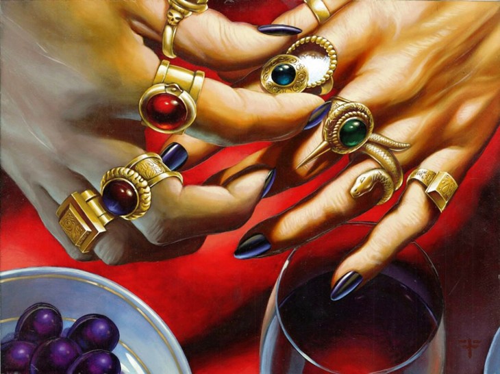
This is really hard to say. Each and every time it is a joy and exciting to work for Magic. Also, if you look at the cards I've done over the years, many of them seem not to be all too specific to a certain setting. If you'd force me to pick one, I'd probably say that I like Alara, especially Esper, but that would only be, well, because you are forcing me to pick one. ;-)
Did you fully switch to digital, or do you still work with traditional media?
You could say that I went through different phases: In the early years, WotC didn't accept any digital art, so all the early works had to be traditional. During those years I tried a couple of different media, mostly acrylics and mixed media and later switched to oils.
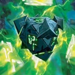
WotCs policy obviously changed later, my first digital art for MtG was Mirror Golem from the Mirrodin set. After that I went mostly digital for a couple of years, but eventually I realized that I missed doing traditional work and that I missed having an original painting at the end of the process. That's when I switched back to traditional oil paintings.
What makes an interesting art description?
That's a good question. I guess the best ones, at least for me, are the ones that give you something to think about. Something that triggers the imagination and then leaves enough room to make my mind work and come up with something interesting.
I had very long descriptions that described everything in minute detail and I had super-short descriptions that basically said almost nothing. Both types aren't necessarily bad descriptions, it's just that one said too much while the other didn't say enough. The sweet spot is somewhere in between.
Your cards are quite varied; we can find figures, landscapes, creatures, artifacts, animals, spells, pretty much everything the game has to offer. Is flexibility one of your strong suits?
I certainly like to think so. It is one the many tasks of the art directors at WotC to choose the best artists for each piece of art they assign. So when you look at the cards that were assigned to me over the years, I guess you could say that the ADs [Art Directors] thought of me as being a good choice for this wide variety of topics.
What were the most challenging cards to paint and conceptualize?
As for the concept, I remember I had a surprisingly hard time to wrap my mind around the cycle of Mimics. If I remember correctly, the description asked for shapeless monsters that hide behind illusions as a "mask".

The Illusions were described as regular inhabitants of that plane, but in a distorted, twisted, creepy way. So, basically a monster that hides behind a mask of a different kind of monster.
As for painting,
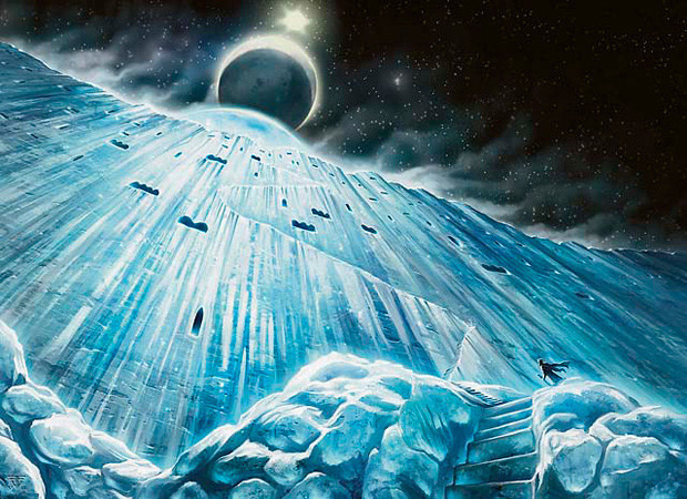
Time of Ice turned out to be quite challenging [more on this below].
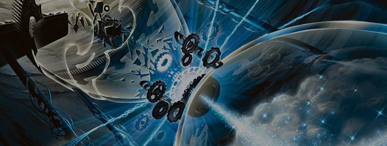
How did you tackle Time of Ice, a card quite different from 'regular' Magic cards, both in format and style?
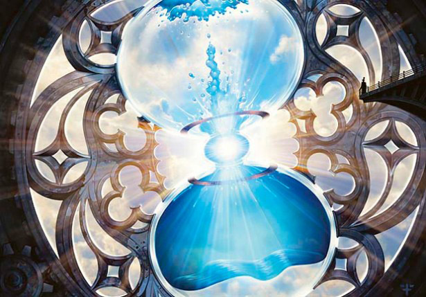
Time of Ice posed a couple of challenges, because of its unique shape and the tools I used. The required style of a "medieval drawing" in which an artist depicts historical events, was right down my alley.
In my work for historical themed board games, I had done something like this a couple of times before, so I was very familiar with it and I knew what they were aiming at right away.
To make this feel "authentic", I decided to go back to mixed media, as I had done in the beginning of my career as Magic artist. I ended up using pretty much everything except oils for Time of Ice: Acrylics, Watercolor, Inks, pencils and color pencils.
I hadn't used many of these in decades, so I had to find my way back into them first. Especially the parts done in ink with drawing pens took me a while to get used to again.
I knew that using this style and these tools, I had to make this drawing larger than I usually do for Magic cards. With a size of 13" x 28" this was the largest single piece I have ever done for Magic.
Blood Moon is one of your most iconic cards, what can you tell us about it?
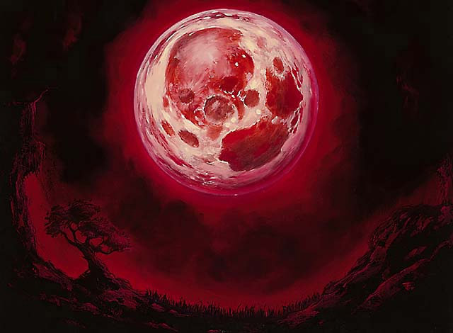
It was one of the first few oil paintings I've done for Magic and the first one I painted on wood. I remember that I was a little worried, because of its simplicity. Its a red moon. What could be exciting about that? When I delivered the piece,
I believed that it wasn't anything special and that it would be re-imagined by another artist in just a couple of years. I really had no idea it would become one of my most popular images and that it would be still in use 15 years later.
When reimagining an existing card, do you take into consideration the original version?
Yes, if I know there is an existing card, I look it up for three reasons. First of all, because I'm curious to see what the card looked like before. ;-)
Second, because it might give me an idea of what I shouldn't do. I don't want to repeat, even accidentally, something that has already been done.
I like to think that a new version of the same card can make the "old" art more interesting as well, because now there are two different takes on the same subject.
And third, because I can find out what the card actually does in the game - this is usually not a part of the art description.
It has happened though, that I found out about the existing card only at a later point. Oh well.
Can you name your favorite cards?
I usually answer this by saying that I don't really have a favorite and that is still true. However there are some pieces that I'm fond of, some of them on cards that never made it far in the community: - Artificer's Hex, Bit of the Black Rose, Clue Token, Esper Panorama, Evacuation, Glassdust Hulk, Magus of the Moon, Profane Memento, Sludge Strider, Seal of the Guildpact, Shard of Broken Glass, Snow-Covered Island, Tuktuk the Returned, Temporal Mastery, Time Sieve, Warlord's Axe. I could go on...
I find Temporal Manipulation a fascinating take on that on time-related art. What can you tell us about this painting?
The idea is based on a sundial, which displays the time by casting the shadow of its gnomon. This sundial however is a magical item, with a second, magical gnomon.
This gnomon can be turned backwards or forwards and it's magical shadow reveals and let's you manipulate what happened before or what will happen in the future.
In this case, the shadow shows us a terrible event, because we can see a lot of dead bodies on the steps of the sundial. We can assume that this event happened in the past, because there is a person finishing the cleanup of the sundial in the present time.
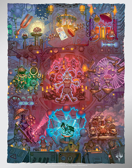
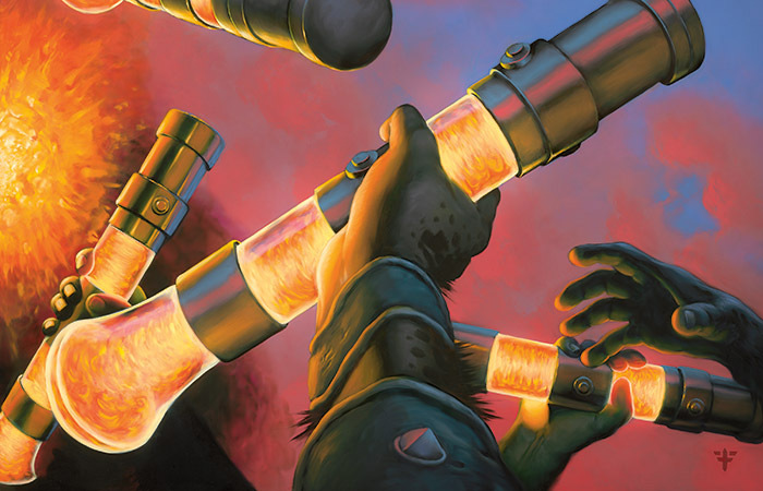
You also painted the contraptions for Unstable, which were 9 cards that comprised this goofy, colorful mega-painting [see below]. How challenging was coming up with these paintings, that had to work individually and together?
I loved working on these! I find it refreshing and inspiring when all of a sudden humor comes into play and turns something that's usually serious on its head.
To piece these nine different cards together into one big composition was not as difficult as I initially thought, because in my case they are parts of a huge machine that is even bigger than the combined cards - we can't see where this machine ends. I had the giant machines from Metropolis [Metropolis, a science fiction movie made in 1927, is one of the most influential movies ever made] in mind, when I made the sketches.
It was important though, to keep in mind where the cards are cut, to make sure that there are details that cross the cutline neatly and establish the connection between the cards.
Also some parts would be covered up by the text boxes etc., so I had to make sure that no important parts would be hidden. There are, however, five minions operating the machine hidden behind the text boxes of the lower three cards, you can spot hints of them.
I imagined them to be like a really fun rock band, operating the machine to a soundtrack from Kraftwerk or Rammstein. ;-)
Where can our readers find more about your work/buy a print?
That's currently a little bit difficult, because I haven't updated my website in such a long time. I freely admit that I'm just horrible at self-promotion. I hope to get to a redesign of my site soon though.
Fans can either write me an e-mail through the website or directly at franz@franz-vohwinkel.com to inquire about prints. I will also happily sign any cards sent to me by mail, if a self-addressed and stamped envelope is included
