Welcome to the 30th interview for our artist interview series.
For today's interview, we had the pleasure of talking with Wayne Reynolds, who has been creating art for Magic since 2004.

Hi Wayne. Your first card debuted on 2004. Tell us a little about how you got started.
My first card was "Call to Glory" for Champions of Kamigawa. Previous to that I'd been working a heck of a lot on one of WoTC's other titles "D&D". I really enjoyed working on D&D 3.5 and it kept me pretty busy. One of the Magic art directors had seen my work on D&D and figured they'd give me a shot on some card art instead.
I liked the idea. Especially that the set I would be debuting on was East Asian themed. I'm particularly interested in history and do lots of research in my spare time. Medieval East Asian history is a favorite era of study. So this setting appealed to my creativity.
I actually got the card dimensions wrong in my first rendition. I had to paint the sides in to the correct dimensions
What has been your favorite plane/expansion to work on?
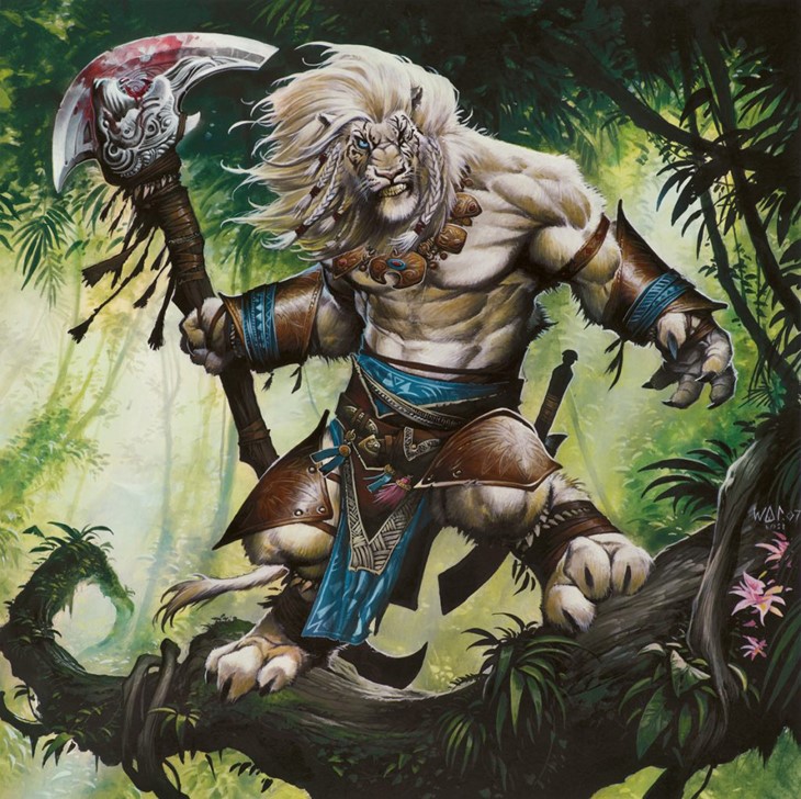
Lorwyn. Because there was something so quintessentially "British" about the art theme. Being a Brit it really appealed to me.
There are weird pathways and faerie roads still in the UK. Where if you walk them at the wrong time of day, you wake up in the morning with no pants on.
I'm pretty sure they're faerie roads.
As an artist working on Magic from 2004 to 2018, what changed during this time period?
I have difficulty remembering last week. Let alone what happened in the span of 14 years.
The only changes that spring to mind are different art directors and an increase in the number of sets.
This is probably not the exciting answer that you were hoping for.
Can you give us a brief description of your painting process for Magic cards?
I get asked this question quite a lot. However, I'm the kind of artist that prefers just doing the art rather than talking about it.
People often remark and ask about how I get the paint so smooth and how I make the art look like it's digital. I don't really have a definitive answer.
From what I can gather, my painting process doesn't appear to be that much different from most other artists. However, there's clearly something that I'm doing that's different from most other artists.
It's just hard to quantify what that is. Much of what I do is on an instinctive level which makes it difficult to describe my techniques and use of colour.
You've probably read plenty of descriptions from other artists about their process. In a lot of respects, what I do is not that much different to any other artist.

I observe things and then transfer what I see or imagine onto a 2d surface. The main difference is probably the way my brain interprets these images which leads to each artists individual style. This part of the process is a mystery, even to me.
This is something each individual artist needs to work out for themselves. Although I attended art college, I did not receive much formal education on painting techniques. The work I created at college bears little relevance to the work I produce now. Using what I did learn at college as a starting block, I am largely self- taught.
I don't have an established method or rules for painting. I vary my technique depending on the subject matter. Sometimes I start with light shades and then add progressively darker shadows. Sometimes I work the other way round, starting with dark shadows and then adding progressively lighter shades. I often change the mix of colours from each new painting.
The range of colours I use for flesh tones on one painting might not get used in the next. Although I clearly have a method of interpreting an image, every painting is different from the last one. I'm always trying new and different ways in which to depict something.
Often I might discover a technique that works really well but then forget how I did it when I do the next painting!
The idea of being filmed or watched whilst I work just feels too intrusive. It's why there aren't any video clips of my painting process.
How did it feel to paint the San Diego Comic-Con Planeswalkers, which are so different from everything else we're used to?
I'm often baffled by questions that ask how I felt about doing a particular piece of artwork. The question infers that I somehow felt differently about creating that piece.
There are times when the creation process can be frustrating in the instances where I can't quite transfer the image that's in my head how I expect it to be on paper.
But art is mostly a joy to create. Even those difficult or frustrating times because an artist either overcomes the difficulties or they learn how maybe to do it better next time.
It doesn't really matter to me what the image is or whether it's going to be a popular/significant card image.
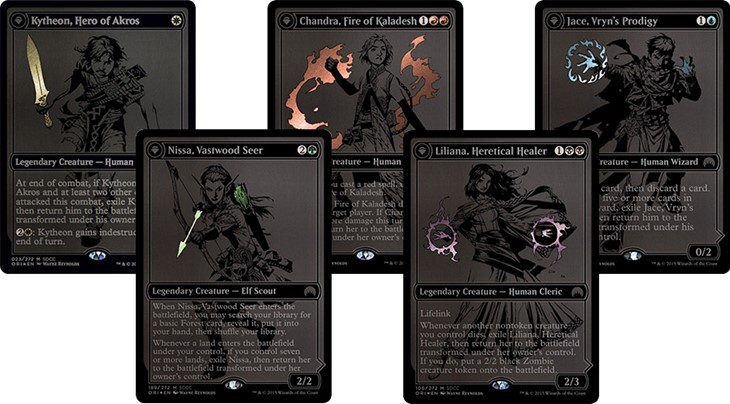
Or if it's going to be a common card. I approach each piece of artwork with the same mental attitude and give it the best try I possibly can at that point in time. Working on the San Diego Comic-Con Planeswalkers was no exception.
The black and white format may be different from what people are used to. However, I spent many years at the beginning of my career creating black and white artwork for UK comics and RPG books. So it wasn't that much of a departure for me. Just an enjoyable return to a medium I'd not used in a while.
What were some of the most challenging cards to paint, and why?
Cards that feature magical effects are amongst the most difficult to paint. Those glowing spell signatures are often tricky to depict convincingly using traditional methods.
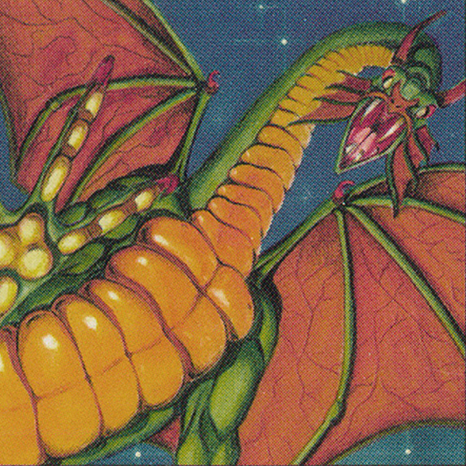
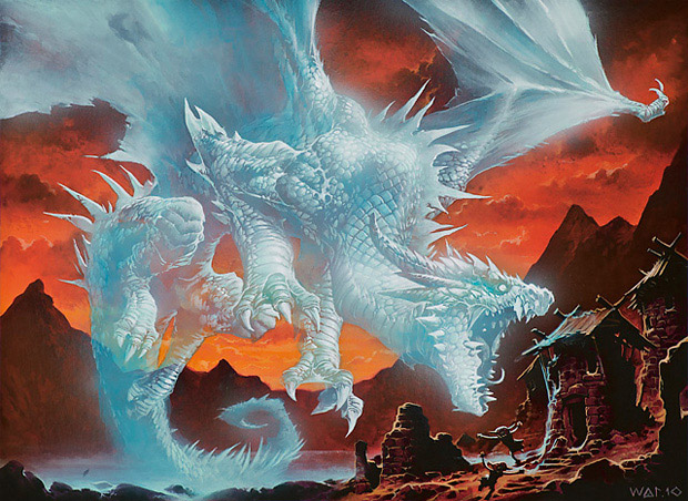
I recall that Phantasmal Dragon was particularly challenging. The translucency of the dragon was done in one go. It incorporated elements of the background viewed through the shadows of the dragon. Consequently, there was no margin for error whilst adding the highlights.
Every brush stroke had to be correct. There was no margin for error. I had to get it right first time otherwise I'd have to completely start again from scratch.
Of the five colors in the game, which one feels closest to home, artistically speaking?
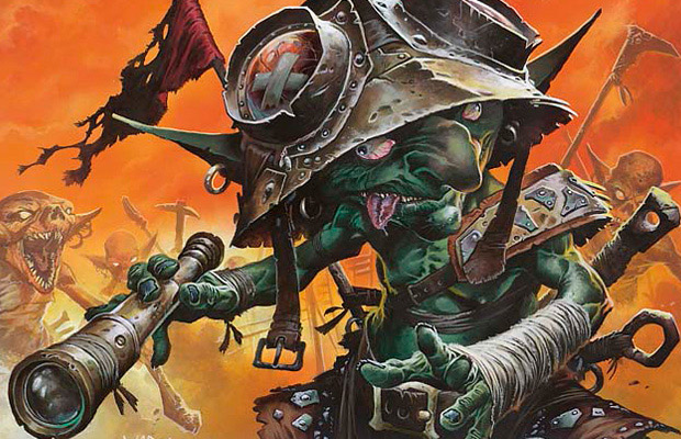
Probably red. Because, GOBLINS!
Of the art you made for Magic, can you name some favorites?
Artists tend to be very self - critical of their artwork. I'm no exception. Probably a more accurate term is card art that I dislike the least. These aren't particularly images belonging to popular or powerful cards. But pieces of artwork that have signified some sort of breakthrough or evolution in my artwork.
Among these are; Thunder Strike, Nivix Cyclops and Furtive Homunculus.
For our last question, is there any Magic related story/episode you'd like to share with us?
I often wonder why there are no dwarves in Magic The Gathering. So each time I participate in a MTG concept push, I create a new dwarf concept sketch for the setting I'm working on.
So far there are 5 different concepts. Each time I try to promote the sketch into being accepted into the setting. I've tried adding cool buzz words to the sketch, neon signs and a parade of small people wearing fancy costumes. I even suggested a new MTG world setting where everyone wakes up one morning to discover they've been transformed into dwarves!
But to no avail.
None of the designs have ever made it into the core setting".. Except one". Kinda.
A sketch design made it into the Return to Ravnica style guide. But I don't think it ever made it onto a card.
I will keep trying until one day, there will be dwarf.
(Parts of this story may, or may not be true)


